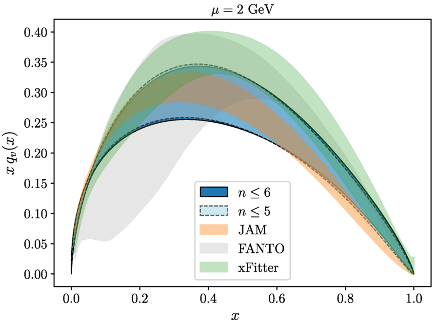
Gradient Flow for Parton Distribution Functions: First Application to the Pion
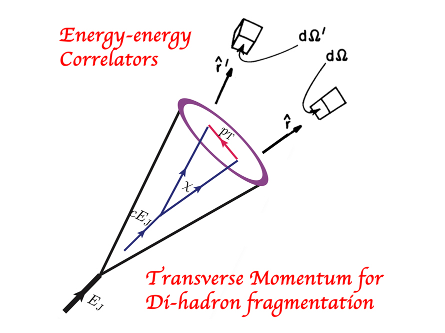
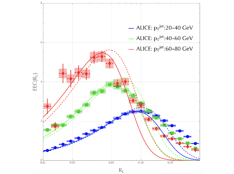
Energy-energy Correlators to Probe Particle Hadronization at Colliders
Di-nucleons do not form Bound States at Heavy Pion Mass
Indications for Freeze-Out of Charge Fluctuations in the Quark-Gluon Plasma at the LHC
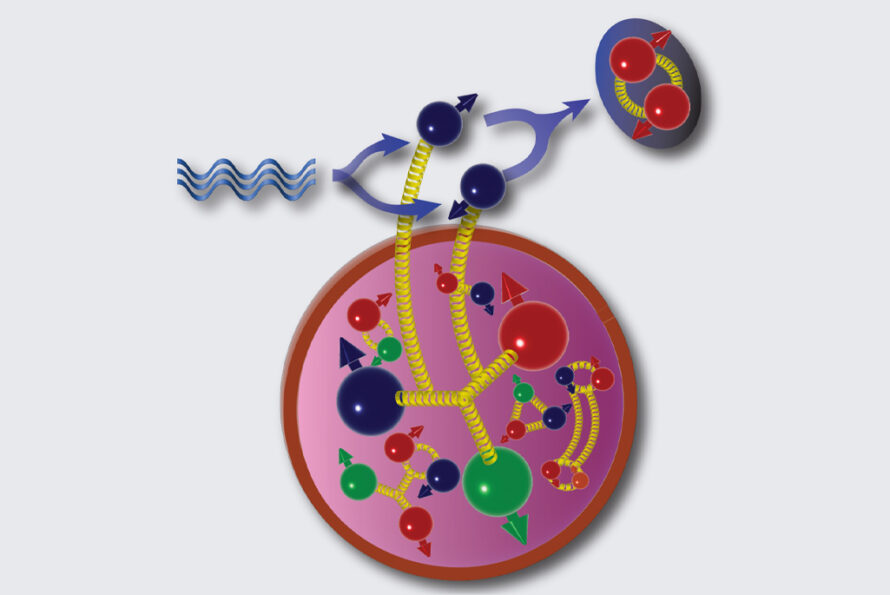
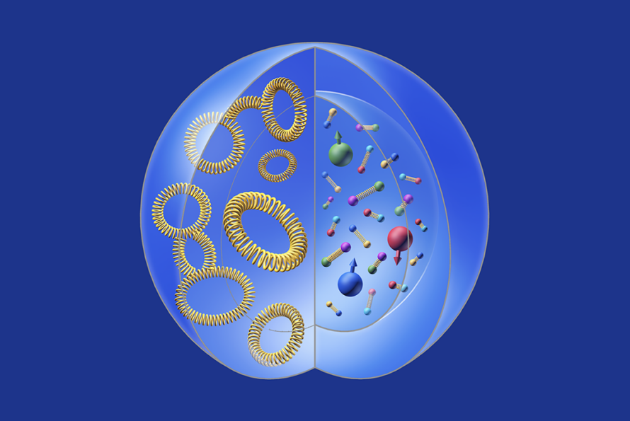
(Determining) Matter Distribution Inside the Nucleons
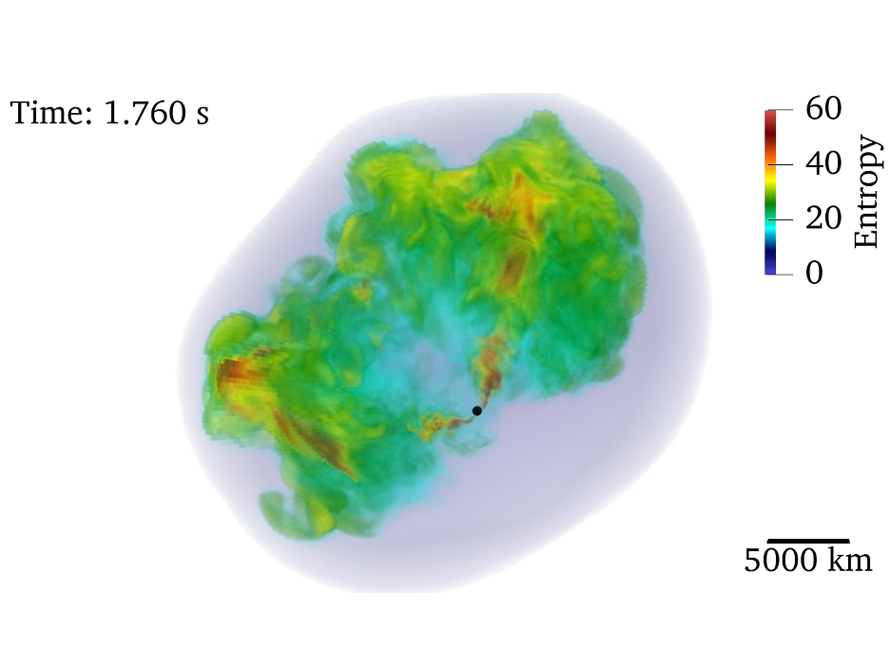
The Whole Shebang: Complete 3D Simulations of Supernovae
Sailing the EIC Science Across the Atlantic
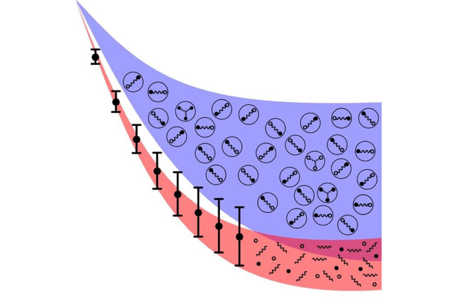
Universal Energy-Energy Correlators at Colliders

Lattice QCD Determination of Nucleon's Gravitational Form Factors
Xin-Nian Wang receives 2024 Humboldt Research Award

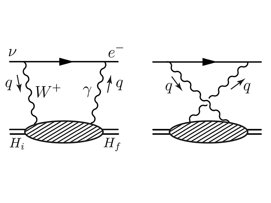
Lattice QCD Calculation of Electroweak Box Contributions to Superallowed Nuclear and Neutron Beta Decays
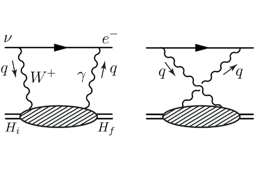
Electroweak Box on Lattice