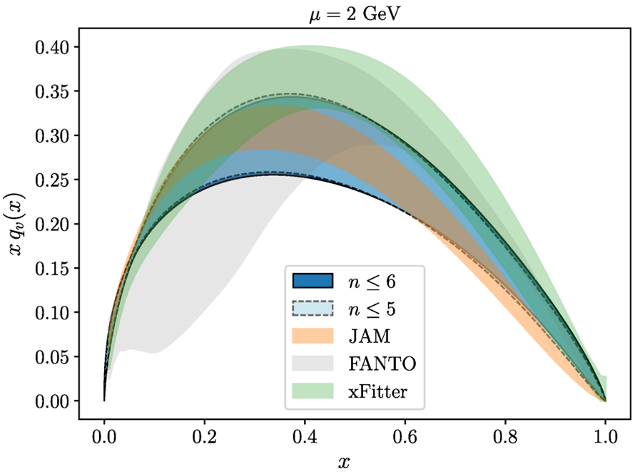
Gradient Flow for Parton Distribution Functions: First Application to the Pion
Indications for Freeze-Out of Charge Fluctuations in the Quark-Gluon Plasma at the LHC
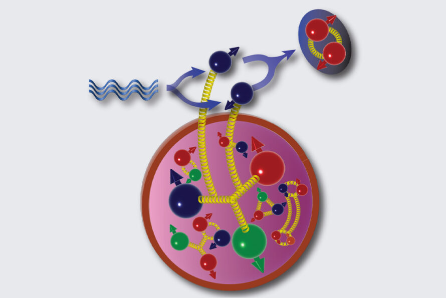
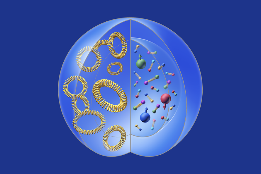
(Determining) Matter Distribution Inside the Nucleons
Universal Energy-Energy Correlators at Colliders

Lattice QCD Determination of Nucleon's Gravitational Form Factors
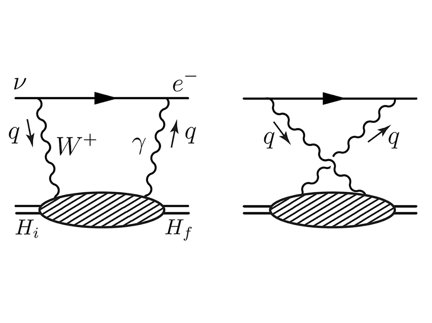
Electroweak Box on Lattice
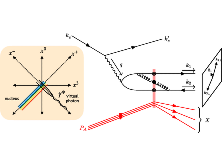
Theory Advance in Gluon Saturation Physics for the Future EIC
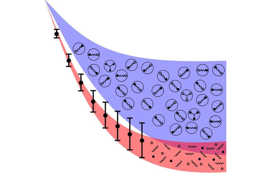
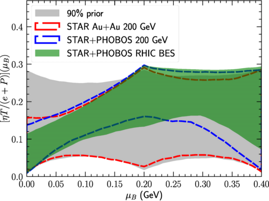
Baryon-Rich Quark-Gluon Plasma
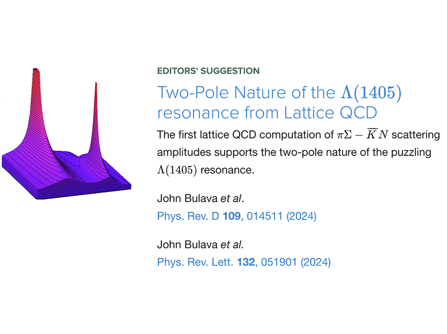
Two-Pole Nature of the Λ(1405) Resonance
Energy-Energy Correlation in Heavy Ion Collisions
Global Bayesian inference of the jet transport coefficient

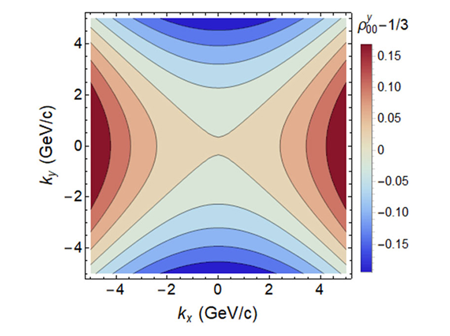
Spin Alignment of Vector Mesons in Heavy-Ion Collisions